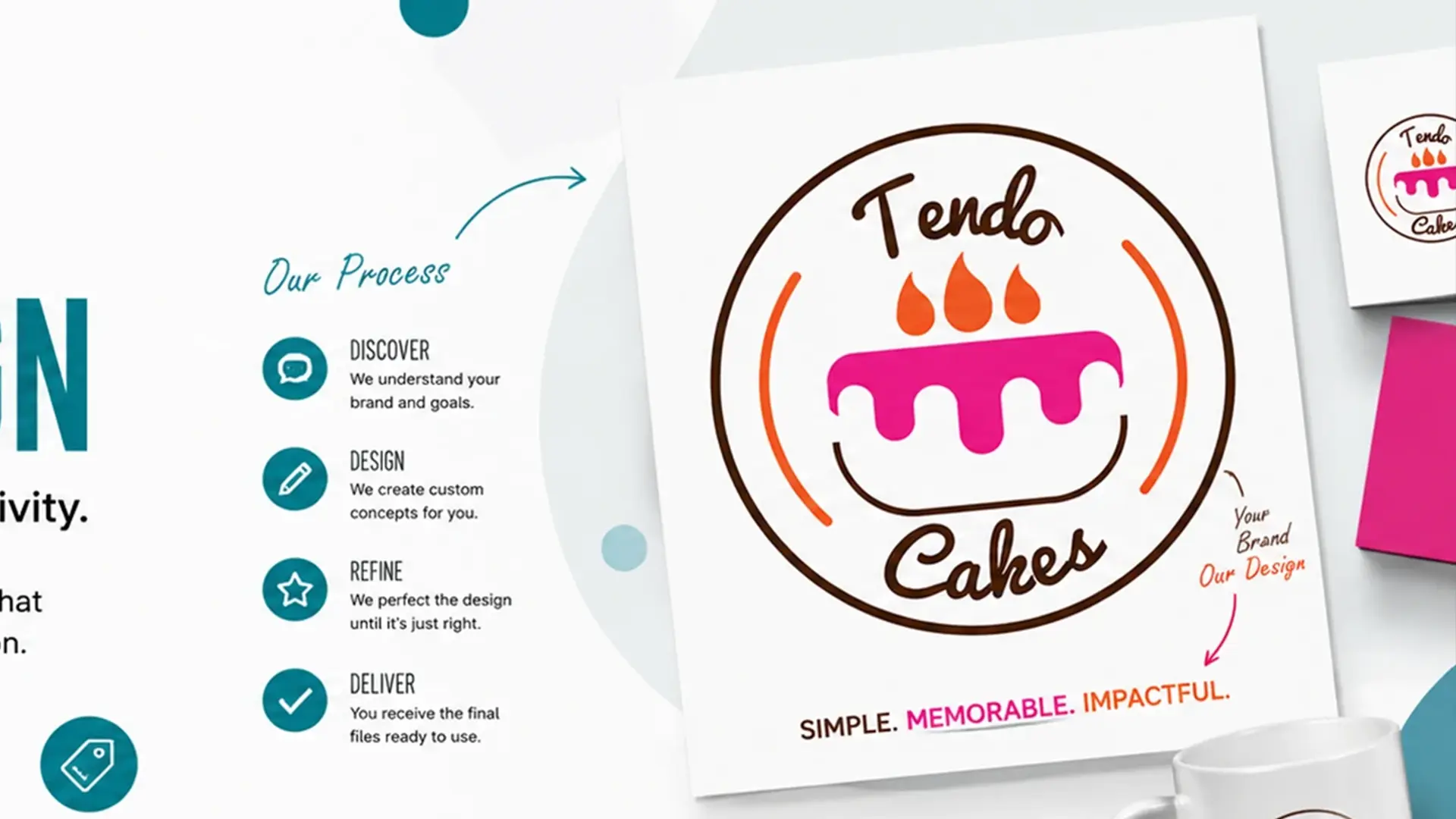
A professional logo is not simply an attractive symbol. It is a compact identity device that must remain recognizable when it is large, tiny, printed, embroidered, placed on a busy photograph or reproduced in one colour.
Start with a useful brief
The brief should explain what the business does, who it serves, what it wants to be known for, where the logo will appear and what competitors communicate visually. “Make it modern” is not enough. Translate vague preferences into observable requirements.
Explore concepts before polishing
Sketching or rough conceptual exploration is valuable because it keeps attention on meaning and composition. Polishing the first idea too early can make a weak concept difficult to abandon.
Keep the idea simple enough to survive reduction
Detail is not automatically sophistication. A useful test is to reduce the mark until it is approximately the size of a small app icon or social avatar. If the distinctive idea disappears, simplify the structure rather than relying on fine detail.
Typography is part of the mark
Letter spacing, weight, proportions and custom adjustments can change the personality of a wordmark significantly. Do not treat the font as an untouched ingredient. Optical corrections often matter more than the font's advertised style.
Test the logo in real contexts
Test light and dark backgrounds, small and large sizes, square and horizontal placements, monochrome use and common business applications. A logo should have useful versions rather than one master file forced into every situation.
Prepare the final package
For a professional handoff, separate editable source files from exported versions. Include appropriate vector artwork, transparent raster previews and clear naming. If the logo will be printed, confirm that the chosen colour specifications and file format match the production method.
What makes a logo trustworthy?
The strongest signal is not complexity. It is whether the design appears deliberate, reproducible and appropriate to the business. A logo that looks impressive in isolation but fails on ordinary applications is not finished.
Victorious Visuals analysis: The real test of a logo happens after the presentation mock-up—when it has to work on the actual materials a business uses every day.
Practical takeaway
Think of logo design as a process of reducing uncertainty: understand the business, explore concepts, test the idea, simplify where necessary and deliver files that can survive real use.