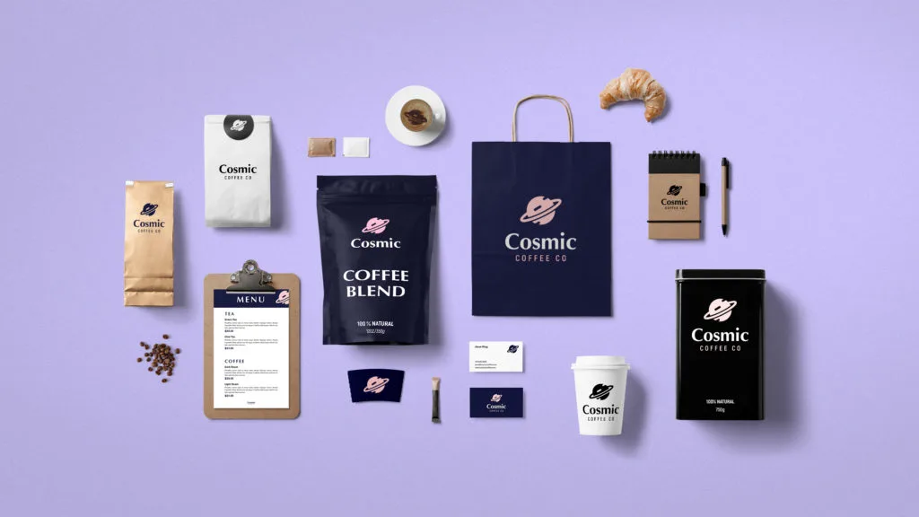
A brand identity is not simply a logo plus a colour. It is a repeatable visual language that helps people recognize a business across places where the logo may not even appear.
That distinction matters for small businesses. A palette that looks good on one social post can fail on a website, printed receipt or signboard. A font pairing that works in a headline can become tiring when used for paragraphs. A strong identity therefore needs rules, priorities and fallback choices.
Begin with the brand's job
Ask what the visual identity must help the business communicate: reliability, energy, affordability, authority, warmth, technical expertise or something else. The answer does not dictate a single colour or font, but it gives you criteria for judging options.
Build a colour hierarchy
Instead of selecting ten colours, define roles. A primary colour carries recognition. Supporting colours provide flexibility. Accent colours should be scarce enough to signal importance. Neutral colours handle backgrounds, text and large areas without competing with the brand.
Test the palette in real situations: a dark headline on a light background, white text on the primary colour, a button, a social graphic and a printed piece. A palette that only works on a mood board is not yet a system.
Choose typography by function
Start with readability. Decide what font will handle body text, what can create headlines and whether a display face is needed for special moments. Limiting the number of typefaces usually makes consistency easier, but hierarchy can still come from size, weight, spacing and case.
Create rules people can actually follow
A useful mini brand guide should answer practical questions: Which colour is primary? Which background should be used? Which font is used for headings? How should contact details be styled? What happens when the primary colour has insufficient contrast? What file versions of the logo are available?
Common failure: changing the identity every time
Small businesses often treat each poster, status update or campaign as a new design project. Variation is healthy, but changing the core visual language repeatedly weakens recognition. Keep the system stable and vary the composition around it.
Quality-control checklist
- Can another designer reproduce the identity without asking you what every colour means?
- Does the palette work in both large areas and small accents?
- Can the typography remain readable on a phone?
- Are there practical alternatives for light and dark backgrounds?
- Does the identity still feel recognizable without the logo?
Victorious Visuals analysis: Consistency is not repetition of one design. It is consistency of the decisions behind many designs.
Practical takeaway
Build a system that survives real use. The best brand identity is not the one with the most choices; it is the one that makes good choices easy to repeat.